Website Concept · Clinical skincare
Aurelia Skin Clinic
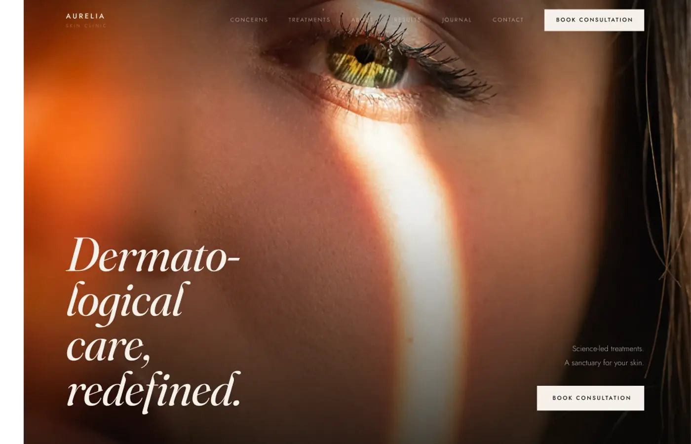
A website study for a modern skin clinic. It tests how editorial design can support clinical information.
01 · Challenge
The design problem.
How might a specialist skin clinic feel credible enough to trust with your skin while remaining approachable enough to book a first consultation?
02 · Objectives
What I wanted to achieve.
- 01Show clinical expertise early.
- 02Make treatments easy to find and compare.
- 03Keep practical information easy to read.
- 04Keep consultation actions visible.
03 · Design direction
A clear visual point of view.
Warm ivory, taupe and black soften the clinical setting without diluting it. A high-contrast serif carries the editorial voice; the sans-serif layer handles treatment information, navigation and reassurance with precision.
Design principles
- 01Put information before promotion
- 02Use photography to explain treatments
- 03Use decoration only when it supports the content
- 04Give each section one clear reading order
04 · Final design
Selected direction

Earlier directions
Two quieter routes explored before the selected direction.
Concept 1

Concept 2

05 · Reflection
What stayed with me.
This study reinforced how much trust can be communicated through composition rather than claims. The strongest direction was the one that let clinical information remain specific while photography and typography made the experience feel considered. If I extended it, I would deepen the treatment-comparison and consultation-preparation flows.
06 · What I explored
The threads inside the work.
- Editorial design for healthcare
- Clinical information and trust
- Responsive information order
- Restrained visual design