Website Concept · Community and social impact
BrightPath
A website study for a community organisation. It tests clear stories, participation routes and responsive design.
01 · Challenge
The design problem.
How can a community website make its purpose immediately understandable while giving participation a warm, practical and credible path?
02 · Objectives
What I wanted to achieve.
- 01Use people and their work as the main story.
- 02Separate programme information from participation actions.
- 03Make impact information easy to read.
- 04Keep the same clear order on every screen size.
03 · Design direction
A clear visual point of view.
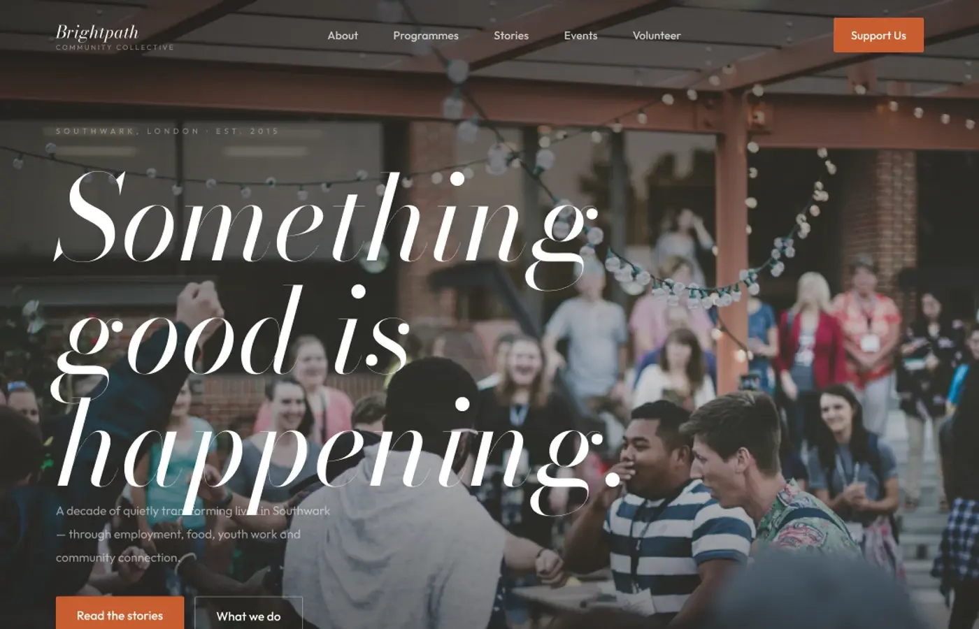
Forest green gives the concept stability while a vivid orange marks moments of action. The serif typography keeps the story expressive; generous off-white space and approachable photography stop the system from feeling institutional.
Design principles
- 01Explain the purpose before asking for action
- 02Use photography that shows participation
- 03Use direct labels for actions
- 04Present concept figures as interface content
04 · Final design
Selected direction

Earlier directions
Two quieter routes explored before the selected direction.
Concept 1

Concept 2

05 · Reflection
What stayed with me.
This exploration made me think more carefully about the difference between energetic design and visual pressure. The orange works best in small, purposeful moments, while the people-centred imagery carries most of the optimism. A future iteration would extend the programme and volunteering journeys beyond the homepage.
06 · What I explored
The threads inside the work.
- Community stories
- Information order for community content
- Accessible actions
- Responsive layouts