Website Concept · Editorial publication
Harbour Notes
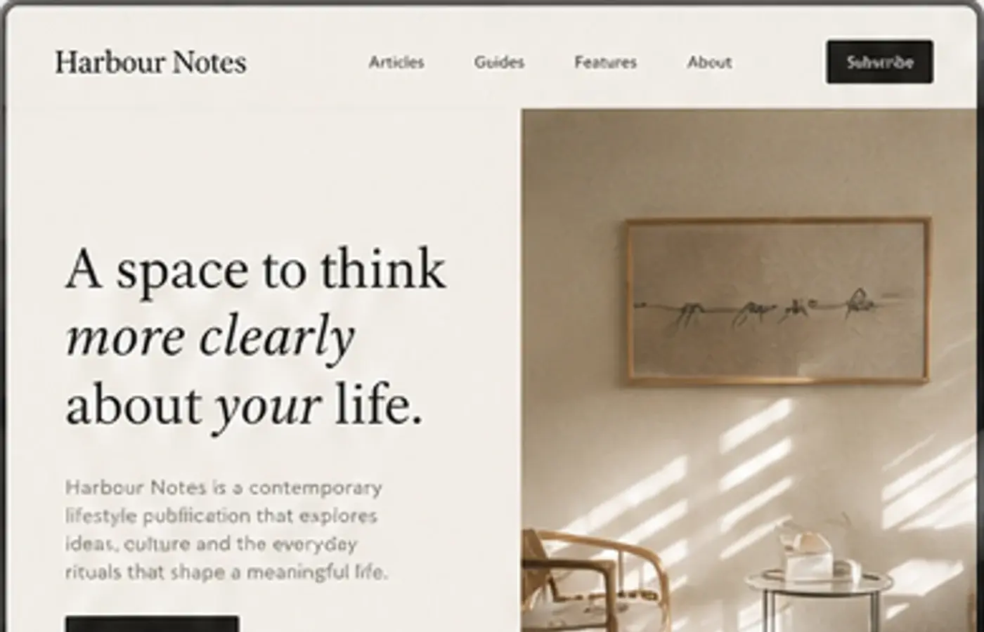
A publication website study. It tests clear content types, focused reading and flexible page layouts.
01 · Challenge
The design problem.
How can a publication make discovery feel generous and unhurried while still giving readers a clear route through different kinds of content?
02 · Objectives
What I wanted to achieve.
- 01Create a clear editorial hierarchy.
- 02Distinguish articles, guides and features.
- 03Support focused reading.
- 04Keep the layout clear on small screens.
03 · Design direction
A clear visual point of view.
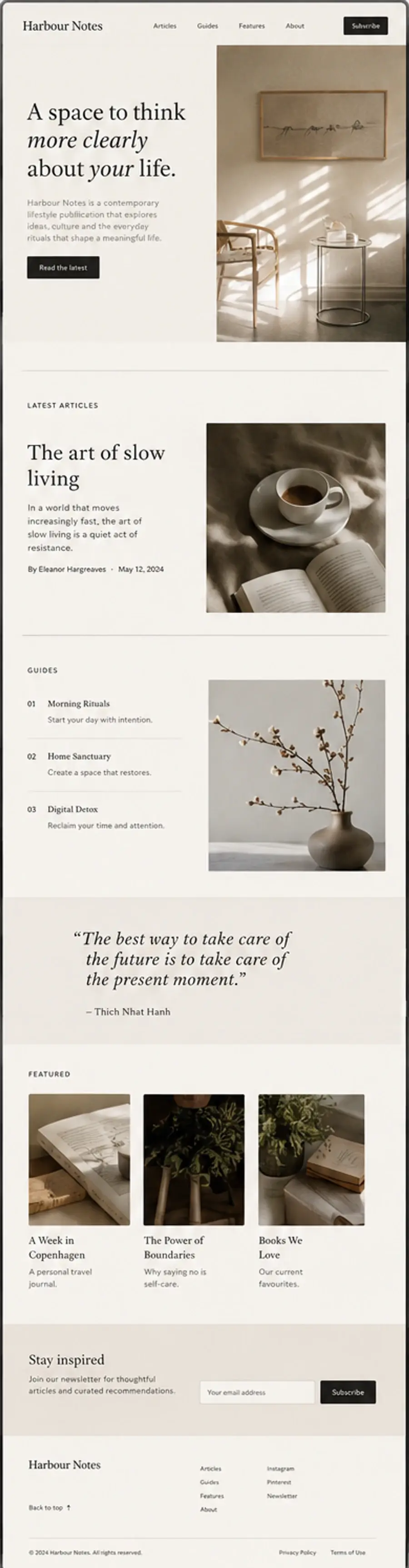
Warm cream, deep brown and quiet neutral photography create a publication that feels collected rather than styled. A Crimson Pro-inspired serif establishes the reading voice, supported by small rules, restrained labels and generous margins.
Design principles
- 01Keep decoration secondary to content
- 02Use readable typography
- 03Use space to separate content
- 04Design around the content
- 05Keep the visual hierarchy consistent
04 · Final design
Selected direction
05 · Reflection
What stayed with me.
The strongest part of this direction is its refusal to fill every space. It made me think about how a publication can feel current without relying on an endless feed. If extended, I would develop the article template, topic archive and a more considered saved-reading pattern.
06 · What I explored
The threads inside the work.
- Editorial information order
- Reading-focused interaction design
- Flexible publication layouts
- Responsive content design