Website Concept · Professional services
Northbridge Advisory
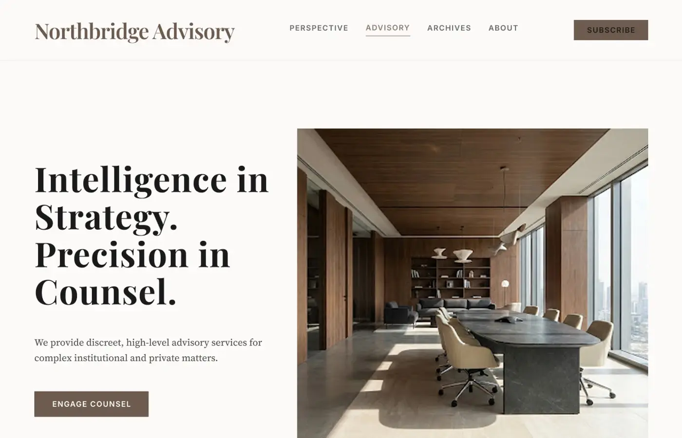
A website study for an advisory firm. It tests clear services, professional trust and a restrained visual style.
01 · Challenge
The design problem.
How can a premium advisory firm communicate complexity and expertise without leaning on predictable corporate visual language?
02 · Objectives
What I wanted to achieve.
- 01Make specialist services easy to scan.
- 02Use hierarchy to show authority.
- 03Create a clear route from an article to a consultation.
- 04Use a consistent responsive grid.
03 · Design direction
A clear visual point of view.
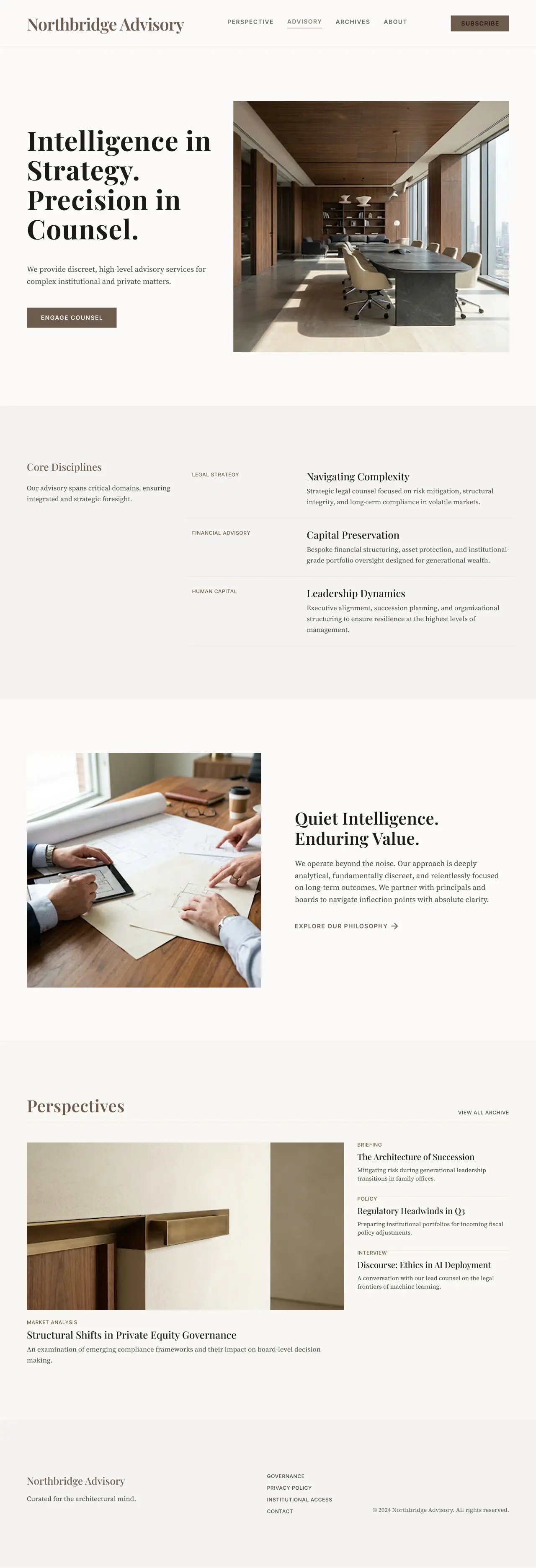
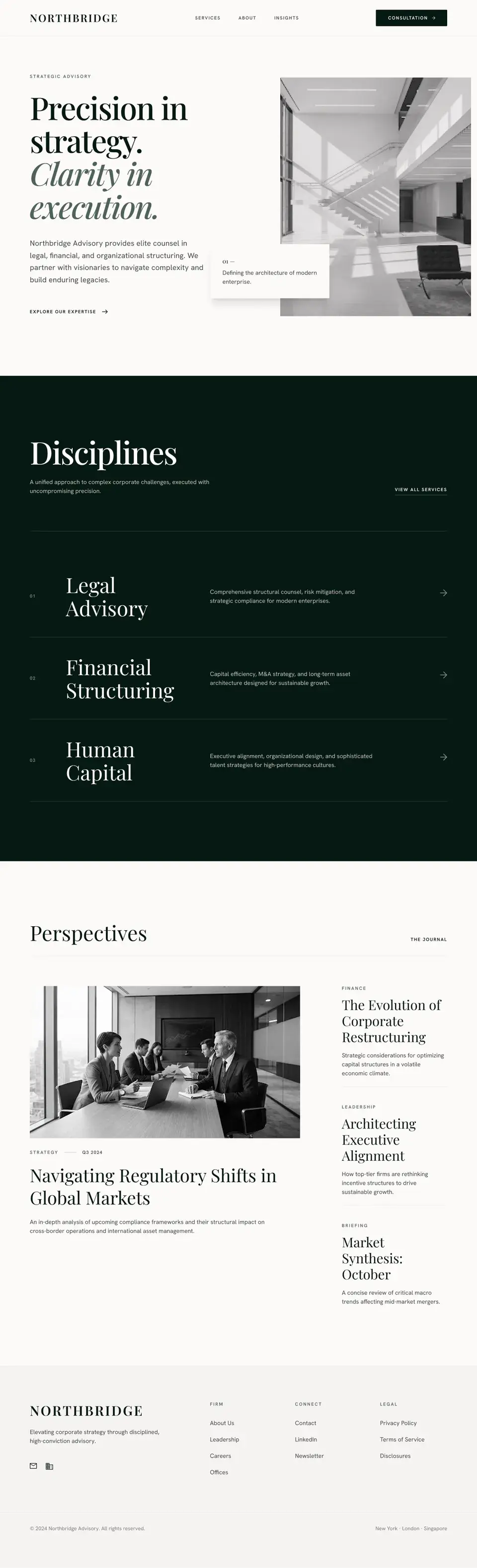
Cream, charcoal and dark green establish a quiet professional register. Architectural imagery gives the design structure without resorting to generic boardroom photography, while the serif headline voice carries confidence with restraint.
Design principles
- 01Explain complex services in clear language
- 02Use typography to organise content
- 03Use space to separate sections
- 04Keep spacing consistent
- 05Use evidence to support trust
04 · Final design
Selected direction
Earlier directions
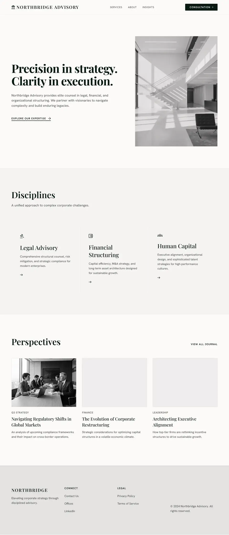
Two quieter routes explored before the selected direction.
Concept 1
Concept 2
05 · Reflection
What stayed with me.
This exploration made me think more carefully about authority as an editing decision. The fewer visual devices the concept used, the more important spacing, naming and sequence became. A longer study would develop service-detail pages and the relationship between insights and consultation.
06 · What I explored
The threads inside the work.
- Professional service positioning
- Clear explanations of complex services
- Typography and trust
- Responsive information structure