Website Concept · Construction and property
Northline
A website study for a construction company. It tests clear services, project evidence and enquiry routes.
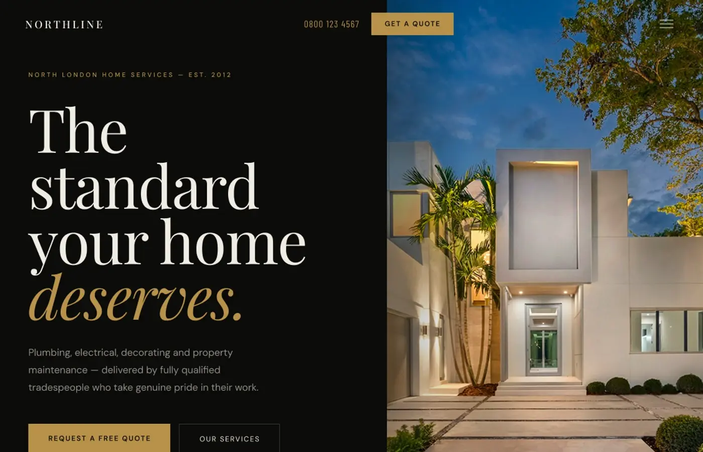
01 · Challenge
The design problem.
How can a construction website communicate craftsmanship and reliability while making services, completed work and enquiry routes immediately useful?
02 · Objectives
What I wanted to achieve.
- 01Use project images as evidence of the work.
- 02Explain the boundary of each service.
- 03Keep strong text contrast on the dark interface.
- 04Keep the enquiry action visible.
03 · Design direction
A clear visual point of view.
Near-black surfaces, warm cream and restrained tan create a premium but grounded construction language. Night architecture sets the opening tone, while lighter project sections provide room to inspect materials and completed spaces.
Design principles
- 01Show completed work before making claims
- 02Keep dark pages easy to read
- 03Give project images useful context
- 04Use practical service language
04 · Final design
Selected direction

Earlier directions
Two quieter routes explored before the selected direction.
Concept 1

Concept 2

05 · Reflection
What stayed with me.
The strongest part of Northline is the transition from a dark, atmospheric opening into brighter spaces where the work can be examined. It reinforced the need for premium design to remain practical. I would next refine project filtering and the quote-enquiry flow.
06 · What I explored
The threads inside the work.
- Project photography
- Clear service information
- Accessible dark interfaces
- Consistent trust signals