Website Concept · Hospitality and café
Sunroom Social
A website study for a neighbourhood café. It tests food photography, local character, menus and bookings.
01 · Challenge
The design problem.
How can a café website communicate what the place feels like before someone ever walks through the door?
02 · Objectives
What I wanted to achieve.
- 01Use food and place photography before general marketing copy.
- 02Make menus easy to scan.
- 03Include the café’s story and community work.
- 04Make booking information easy to find on every device.
03 · Design direction
A clear visual point of view.
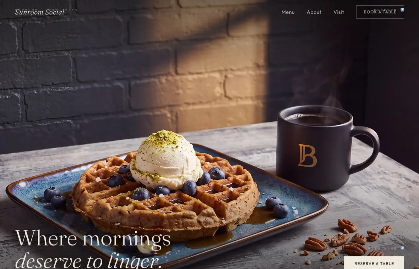
Warm cream, espresso and burnt orange create a morning-light palette. Close food photography, brick, timber and handcrafted details are arranged with editorial typography so the concept feels neighbourhood-specific rather than generic.
Design principles
- 01Show the place and food first
- 02Use food as the main visual content
- 03Keep practical information easy to scan
- 04Use warm colours and material textures
- 05Use specific details to explain the story
04 · Final design
Selected direction

Earlier directions
Two quieter routes explored before the selected direction.
Concept 1

Concept 2

05 · Reflection
What stayed with me.
This concept reinforced how much hospitality design depends on sensory detail. The layout works best when photography establishes warmth and the interface quietly supplies practical information. A further iteration would deepen the menu, events and reservation states without losing that morning rhythm.
06 · What I explored
The threads inside the work.
- Hospitality stories
- Food-first visual order
- Local community content
- Simple booking routes